
Swatch - Usage
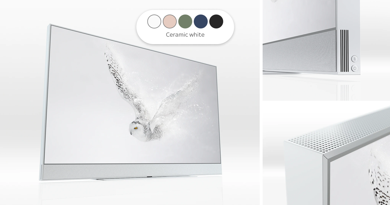
Example of using Swatches for discovering product colour options
Basic Guidelines
The static Swatches are mostly used as a set to provide an overview of all available colours for a product. Selectable Swatches work well for discovering products as they provide a quick preview of how the product looks like in different colours.
To select a product in a purchase journey, we recommend using the Swatch on a Radio Card instead, as this can offer a preview combined with the colour’s description and is therefore more accessible.
Behaviour
Selectable Swatches behave similar to Radios and should be treated as such:
- As a best practice, one Swatch is already selected by default. We recommend using the most desired or frequently selected option as the default.
- Clicking an unselected Swatch will deselect whatever other Swatch was previously selected from the list.
Adjustable Elements
The Swatch component can be set to show a matte colour or making use of a gradient to emulate a gloss finish. It is also possible to display an image instead of a colour (e.g to show a textured surface).
Alignment
The static variant of the Swatch can be used to showcase colours for a product at an overview level. This can be achieved with negative spacing between items. We also recommend changing the Auto Layout order within Figma to “First on top” (this is the reverse order from the default “Last on top”).
Accessibility
The optional ‘Contrast outline’ can be used to enhance the contrast between the swatch and its background. The colour of the outline defaults to Grey-50 and should only be altered when swatch and background combination don’t achieve the required contrast ratio of 3:1.